
Chrome and theme settings control the overall look of a layout.
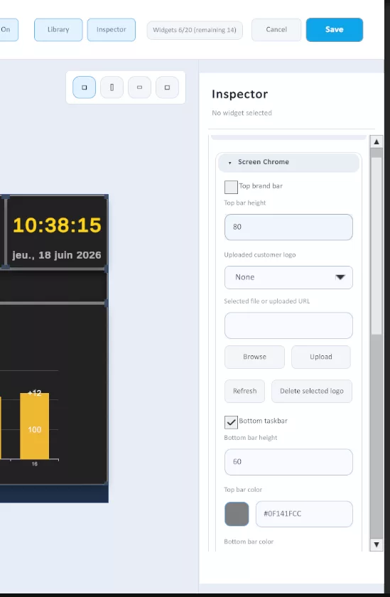
- Chrome is the frame around the content, such as the top bar, bottom bar, and logos.
- Theme controls the layout background color and the default background color for widgets.
Use these settings when you want your dashboard to match your site, line, plant, or company branding.
1. Where to Find Chrome and Theme Settings #
- Open the Layout Editor.
- Click an empty area of the canvas so no widget is selected.
- Use the inspector on the right.
When no widget is selected, the inspector shows the layout-level settings, including chrome and theme.
If a widget is selected, you are editing that widget instead of the whole layout.
2. Understand the Screen Area #
Twinnoverse layouts are designed for a 16:9 landscape screen.
- the base screen size is 1920 x 1080
- widgets use the main content area
- top and bottom chrome bars reduce the usable space available to widgets
This means chrome is not only visual styling. It also changes how much room you have for content.
3. Top Bar #
The top bar is optional.
By default:
- top bar is disabled
- top bar height is 80 px
You can use the top bar to show branding across the top of the layout.
Top bar settings include:
- enable or disable the top bar
- top bar height
- top bar color
- logo padding
- customer logo scale
- customer logo path
The platform brand logo is also part of the top bar configuration.
Practical use cases:
- show your company logo on production screens
- keep a consistent look across multiple dashboards
- separate dashboard chrome from the main KPI area
4. Bottom Bar #
The bottom bar is the lower reserved bar on the layout.
By default:
- bottom bar is enabled
- bottom bar height is 60 px
You can:
- enable or disable the bottom bar
- change the bottom bar height
- change the bottom bar color
On the reader side, this lower area also works with the runtime display layer, so it is best to treat it as reserved screen space rather than filling it with critical dashboard content.
5. Logos #
The top bar can show:
- the platform brand logo
- an optional customer logo
Customer logo settings let you control:
- which logo to use
- padding from the edge
- logo scale
Logo scale is clamped to a safe range, so extreme values are limited automatically.
The customer logo workflow in the admin editor supports:
- choosing a stored logo
- refreshing the logo list
- uploading a new logo
- deleting the selected stored logo
If no customer logo is configured, the top bar can still work with just the platform branding.
6. Theme Colors #
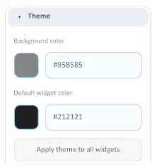
Theme settings control the layout-wide colors.
By default:
- background color is
#161616 - default widget color is
#F2F4F8
These settings do two different jobs:
- Background color controls the canvas color behind the widgets
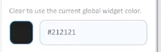
- Default widget color is the background color used for newly added widgets
This is useful when you want all new widgets to start from a consistent visual style.
7. Apply Theme to Existing Widgets #
The layout inspector includes an action to apply the current default widget color to all widgets.
Use this when you want to quickly unify the look of an existing layout.
Important detail:
- changing the default widget color affects new widgets
- applying the theme updates existing widgets to that default background
- individual widgets can still use their own background override color
So the layout theme gives you a fast baseline, but widget-level styling can still differ when needed.
8. Widget-Level Overrides #
Theme settings work at the layout level, but widgets can override their own styling.
Common widget-level styling includes:
- background override color
- text color
- accent color
- warning color
- error color
Use layout theme for consistency first, then use widget overrides only where you need emphasis.
9. Best Practices #
Do #
- choose chrome colors that support readability
- keep the layout background darker if the screen is used in bright industrial spaces
- use one default widget color across the whole layout before making exceptions
- reserve enough time and space for logos if branding matters
- remember that bars reduce the space available for widgets
Avoid #
- making bars so tall that the content area becomes cramped
- using very bright chrome colors that compete with the data
- mixing too many widget background colors without a clear reason
- relying on widget overrides for every single card instead of setting a clean layout theme first
10. Simple Example #
A common setup for a shopfloor dashboard is:
- dark background for the main canvas
- dark top bar with company logo
- dark bottom bar kept as reserved system space
- light widget cards for KPI contrast
- one accent color for progress, status, or highlights
This gives you a layout that feels branded without making the screen harder to read from a distance.


